Randomly

 Home
Home
Installing Randomly
- Randomly only works with Python 3 (not Python 2), so be sure that your notebook is using a Python 3 kernel. The easiest way to install randomly is via the command line with pip:
$ pip install randomly- Now we can import the package in our python notebook:
>>> import randomlyLoading the Data
- As an example, we are going to use a dataset of 1459 human pancreas cells from Baron1.
- Click here to download this sample data set.
- Unzip the file.
- To load our data, we use Pandas:
>>> import pandas as pd
>>> df=pd.read_table('example.txt', index_col=0)- The input should be a table with cells in rows and genes in columns:
>>> df.shape
(1459, 17287)
Initialization and Preprocessing
Initialization of the model
- Each time that we want to start or re-start the analysis we have to run:
>>> model = randomly.Rm()Preprocessing the data
- This function removes non-desired cells and genes:
- We remove all the genes and cells that have less than
min_tptranscripts expressed. - We remove cells that express less than
min_genes_per_cellgenes. - We remove genes that are expressed in less than
min_cells_per_cellcells.
- We remove all the genes and cells that have less than
>>> model.preprocess(df, min_tp=0,
                            min_genes_per_cell=0,
                            min_cells_per_gene=0,
                        refined=True)
Cell names are not unique. Cell names are reset
Run the refining function
Advanced preprocessing
- If you want to use the advanced feature
refined=True(as we have done before) then, as function indicates, you have to run the functionmodel.refining()afterwards:
>>> model.refining(min_trans_per_gene=7)
1459 cells and 11389 genes- This function removes sparsity in a more efficient way.
- The parameter
min_trans_per_genedefines a cut-off on genes. In this example,min_trans_per_geneequals 7. This parameter should be choosen such that the total number of remaining genes is bigger than at least 8000. In this example, we leave 11389 genes.
Modeling the data using Random Matrix Theory
>>> model.fit()
Preprocessed data is being used for fitting
Plot of Marchenko-Pastur distribution
>>> model.plot_mp()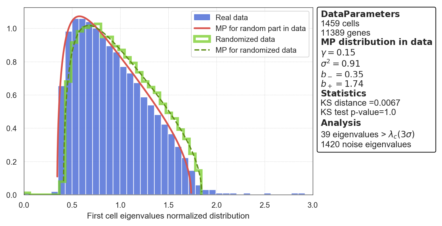
Save the plots
If you want to save the plots generated by any of the Randomly functions, you can do it by adding the option path=folder/name.extension, where extension could be: pdf, png, jpg, etc. For example:
>>> model.plot_mp(path='Data/my_marchenko.pdf')Plot the statstics of signal-like genes
>>> model.plot_statistics()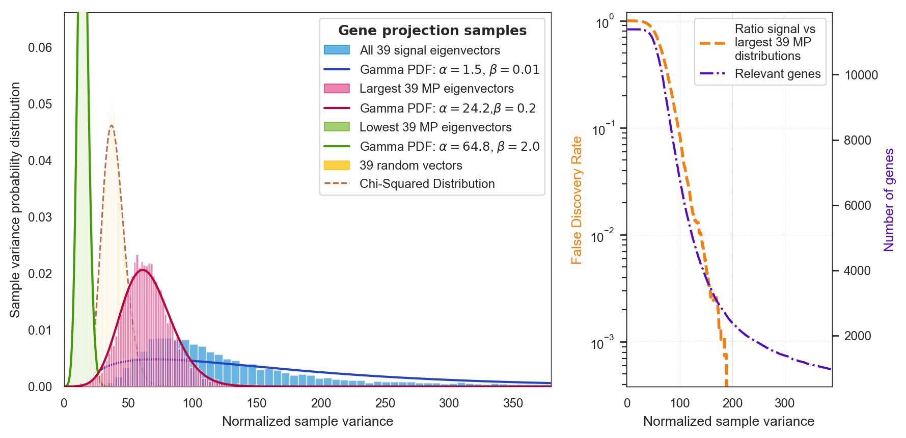
Get the denoised data
- You can use the false discovery rate ("fdr") shown in the previous plot to select the genes which are responsible for the signal. In this case, fdr=0.0001 corresponds to 2590 genes:
>>> df2 = model.return_cleaned(fdr=0.0001)
>>> df2.shape
(1459, 2590)- Alternatively, you can use the Normalized sample variance (
sample_variance) shown in the y-axis of the previous plot. For instance, this allows you to select the top 1100 most signal-like genes. In this case, by selectingsample_varianceequals 350, we get 1101 genes:
>>> df2 = model.return_cleaned(sample_variance=350)
>>> df2.shape
(1459, 1101)
Save the denoised data
If you want to save the denoised dataset in your computer, you can do it by adding the option path=folder/name.txt. For example:
>>> df2 = model.return_cleaned(sample_variance=350, path='Data/my_denoised_data.txt')Visualizing your Denoised System
t-SNE plot for visualization
Once you know the signal-like genes you want to use based on the previous step, Randomly allows you to visualize it using t-SNE:
>>> model.fit_tsne(sample_variance=350)
computing t-SNE, using Multicore t-SNE for 4 jobs
atribute embedding is updated with t-SNE coordinates
>>> model.plot()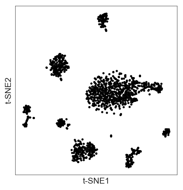
Hierarchical clustering
- Randomly has a function to perform unsupervised hierarchical clustering in the denoised data:
>>> model.fit_hierarchical()- By adjusting the threshold
thrs, you can select the clusters:
>>> model.visual_hierarchy(thrs=100, value_range=2)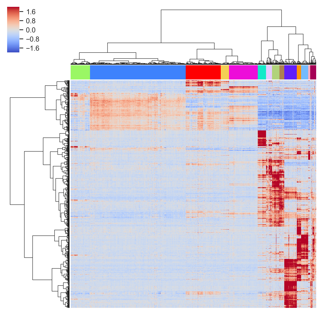
- And visualize these clusters in the t-SNE:
>>> model.plot(labels=model.labels_hierarchy, legend=True)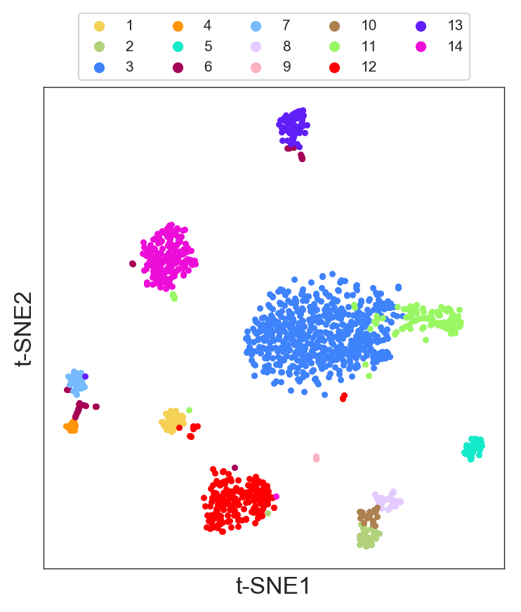
K-means clustering
- Randomly also has a function to perform k-means clustering. The parameter
n_clustersselects the number of clusters:
>>> model.fit_kmeans(n_clusters=16)- You can visualize the k-means result in the t-SNE:
>>> model.plot(labels=model.labels_kmeans)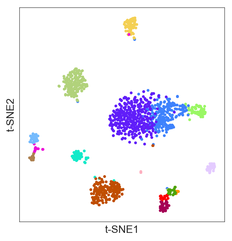
Gene expression profile across the clusters
- Randomly has a function
model.get_gene_info()that allows you to analyze your clusters to get biological insight. - The function
model.get_gene_info()gives the expression profile of a gene or a list of genes across the different clusters. It does this by performing a violin plot and a ridge plot. - The colors correspond to the label colors of the clustering methods (hierarchical or k-means) previously described.
- In following example, we will use the clusters obtained in the hierarchical clustering, using
labels=model.labels_hierarchy, to visualize the gene 'INS':
>>> model.get_gene_info(labels=model.labels_hierarchy, gene=['INS'], size=8)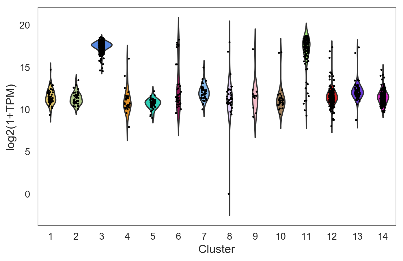
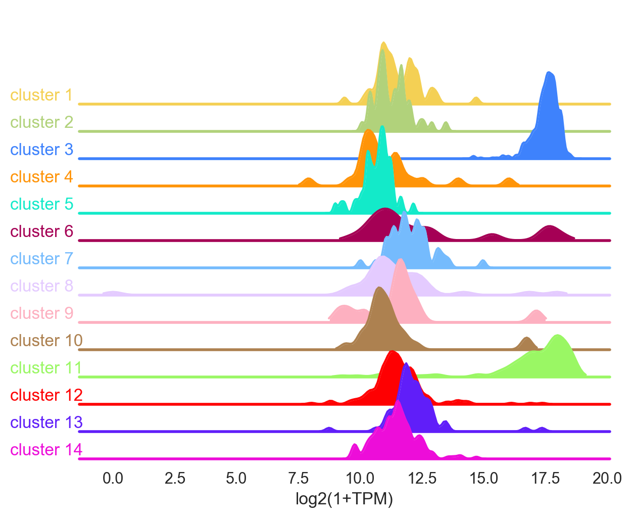
If several genes are used, for example gene=['INS', 'PPY', 'PDFGRA'], then the function gives the average of the genes in the list.
Visualizing the Genes
- Randomly has a function to visualize the gene expression in the t-SNE:
>>> model.plot(gene=['PPY'], size=4)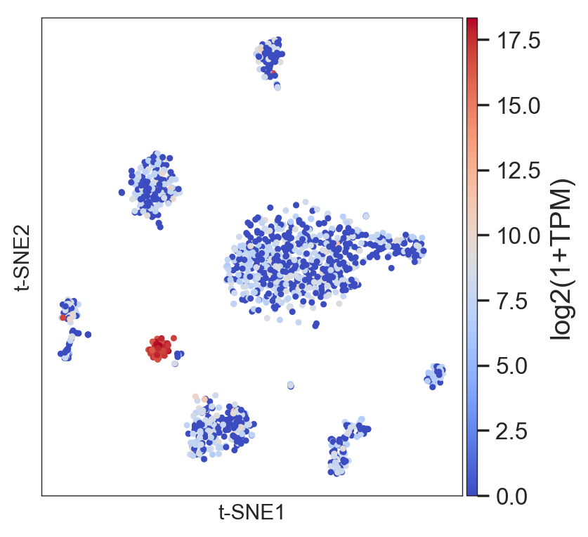
or the average of a set of genes:
>>> model.plot(gene=['DDIT3','HSPA5','HERPUD1'], size=4)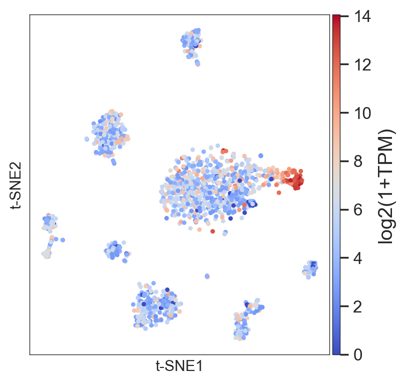
- The same function allows you to visualize a list of individual genes:
>>> model.plot(gene=('PPY','GCG','SST','INS','GHRL','CPA1','KRT19'
                                    ,'RGS5','PDGFRA','VWF','SDS','SOX10'))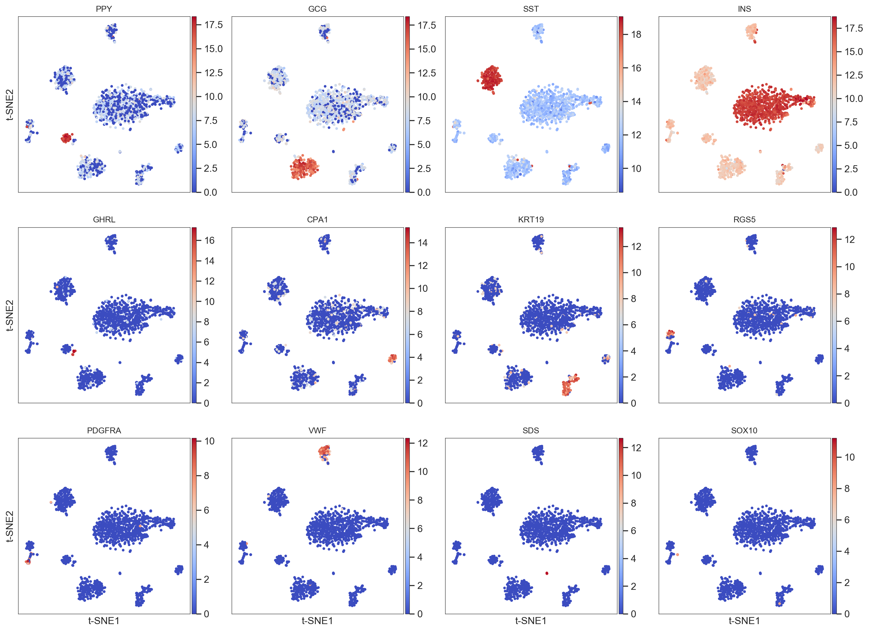
Tips and Tricks
Get information about the clustering
The function model.get_cluster_info() gives information about the clusters produced by the methods described previously:
- The number of cells.
- The 10 (by default) most expressed genes. By using
genes = numberwe can increase the list. For example,genes = 20will give the top 20 genes. - The function visualizes the genes in the t-SNE.
>>> model.get_cluster_info(labels=model.labels_hierarchy, cluster=1)
The cluster 1 has 49 cells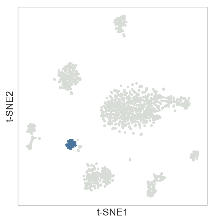
The top 10 highly expressed signal-like genes in this cluster are:
        PPY
        EEF1A1
        GNAS
        FTL
        PCSK1N
        CHGB
        SST
        CLU
        SCG2
        MALAT1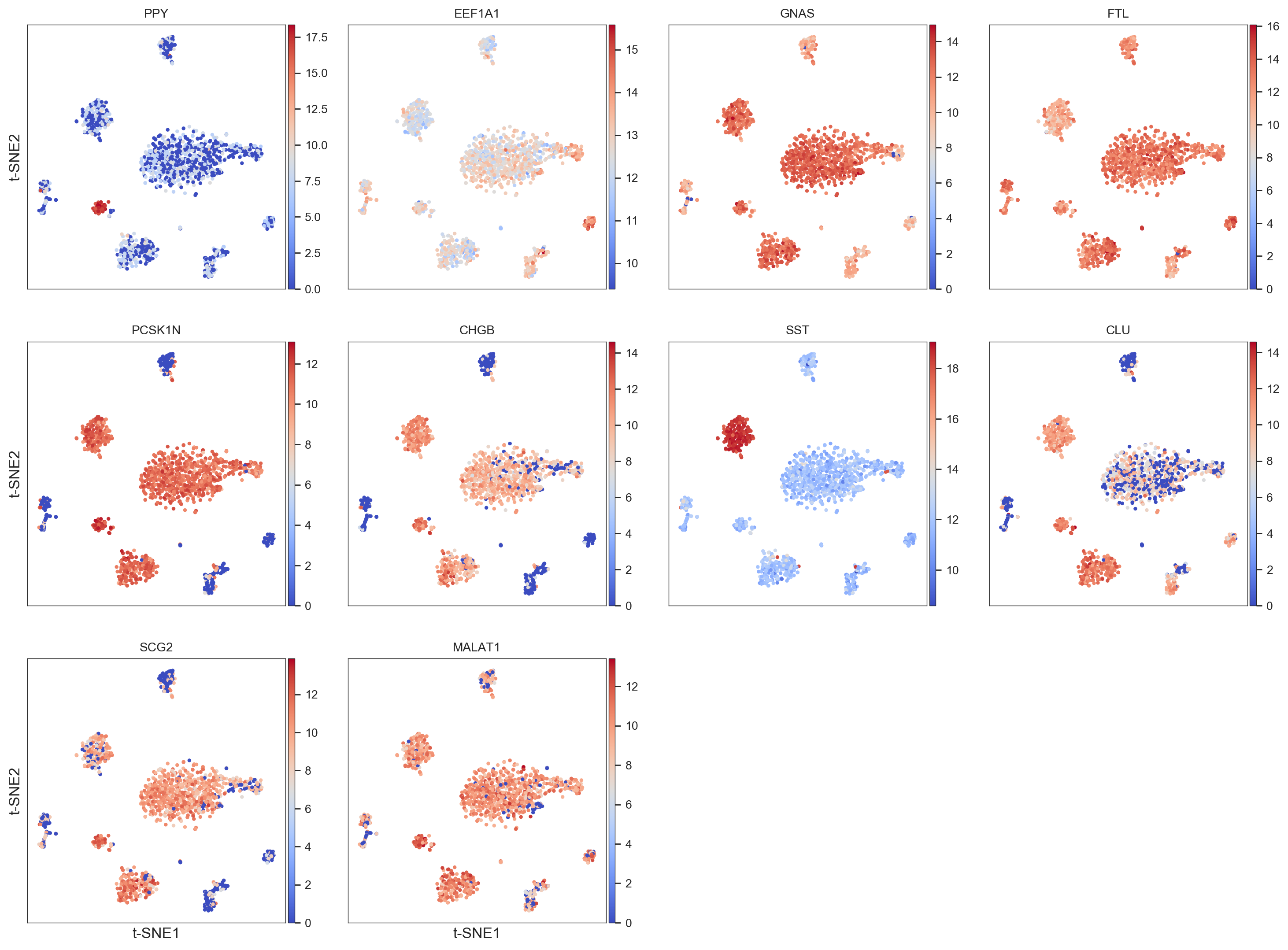
Plot the library complexity of the original dataset
>>> model.plot(gene=['library'], size=4)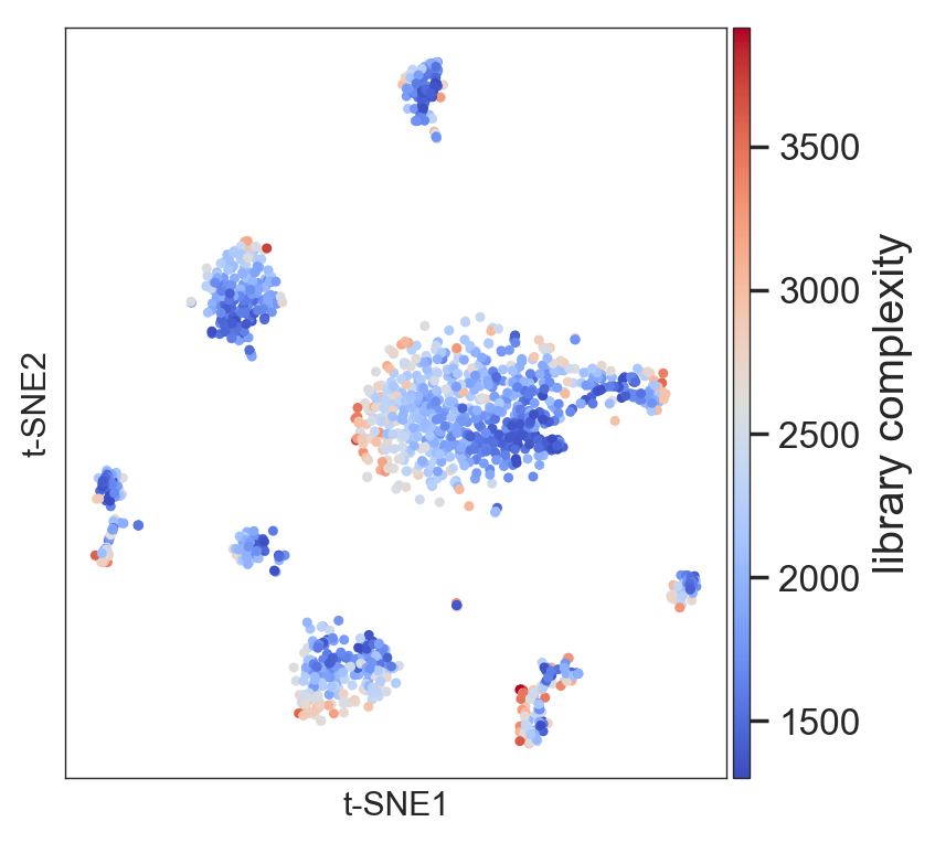
Add a legend and more
- You can add a legend to t-SNE plots to identify your cell populations and subpopulations after your analysis.
- To identify the order of the color code, it is useful to start using
legend=True. We already did this when we performed the hierarchical clustering. - Once you know the color code, then add the legend list
legend=[list of your names]. For example:
>>> my_legend=['Gamma', 'Ductal (CFTR+)', 'Beta', 'Activ.stellate', 'Acinar', 'Stellate (TIMP1+ & CD44+)',
                    'Quiesc. stellate', 'Ductal (MUC1+ & TFF1+)', 'Macrofage', 'Ductal (CD44+ & CFTR- )',
                    'Beta stressed', 'Alpha', 'Endothelial', 'Delta']

>>> model.plot(labels=model.labels_hierarchy, legend=my_legend, legendcol=3, size=6, points=7)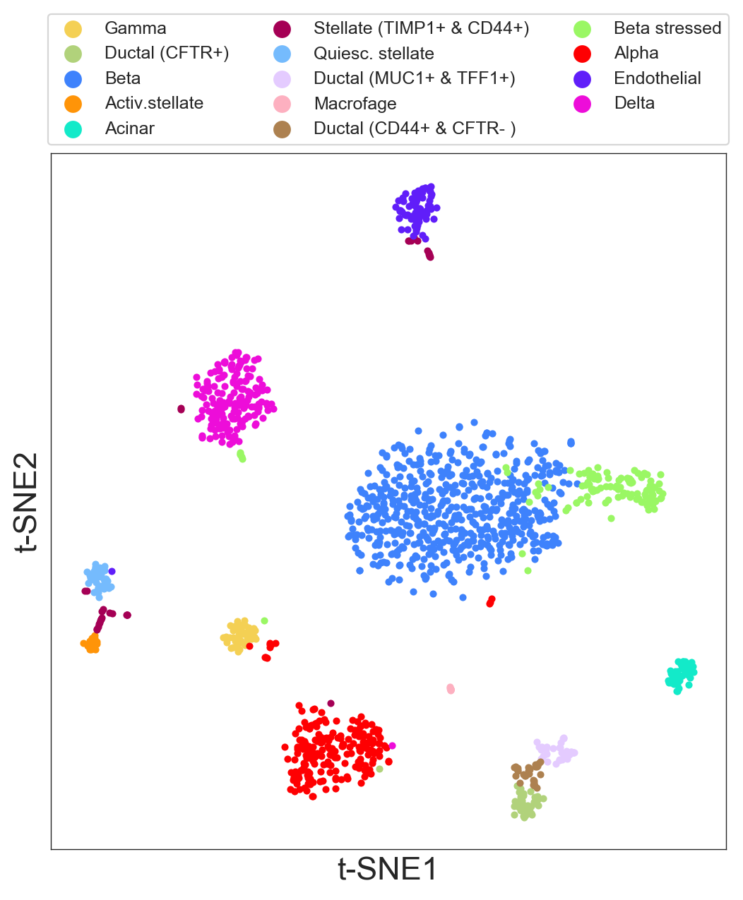
legendcolsets how many columns you want to plot in the legend.sizesets the size of the plot.pointssets the size of the points.
You can use the same legend for the get_gene_info() function and get publication-ready plots. For example:
>>> model.get_gene_info(labels=model.labels_hierarchy, gene=['INS'], size=8, legend=my_legend)MAC OS with retina screen
If you are using a MAC OS with retina display, to increase the quality of your plots you should use this option at the beginning of your script:
>>> %config InlineBackend.figure_format = 'retina'Using a Different Preprocessing or Normalization
If you want to do custom preprocessing—for example, you don't want to use TPMs (transcripts per million); or you want to select your own genes or your own cells in a different way—you can avoid the preprocessing step and safely jump to The Modeling Section above, using:
>>> model.fit(df = df)References
- Baron, M. et al. A single-cell transcriptomic map of the human and mouse pancreas reveals inter- and intra-cell population structure. Cell Syst. 3, 346–360.e4 (2016)